


Vegea
Vegea is a personal project of a logotype for a natural body care brand and it's the final project for a typography course. I also created the name.
Brief
The course suggested, in order to start the project, to create a fake brief.
It stated that Vegea is a new young brand that uses 100% natural ingredients for its products. The values expressed by the logotype and whole brand identity are elegance, delicacy, self care but also the strong green aspect and the hand-made manufacture.

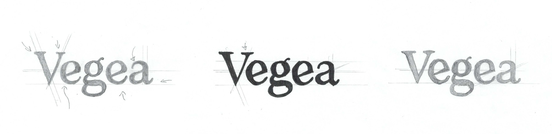
Typography
The typeface I chose to start the process is Temeraire.
I printed the original text in several versions with different letter spacing. I used thin papers to hand copy the basic structure of the text and lastly I started sketch my own logotype.
My goal was to design a logotype that was elegant but also revealed the context and the hand made nature of the products.
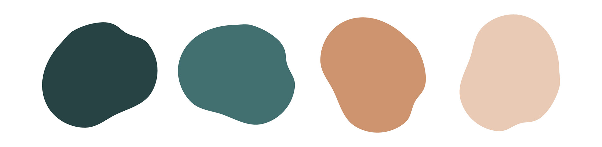
Colors
Colors had to express the context and the green vibes at first glance. They are both elegant and delicate.
These color spots recall immediately the hand-made nature of the products.
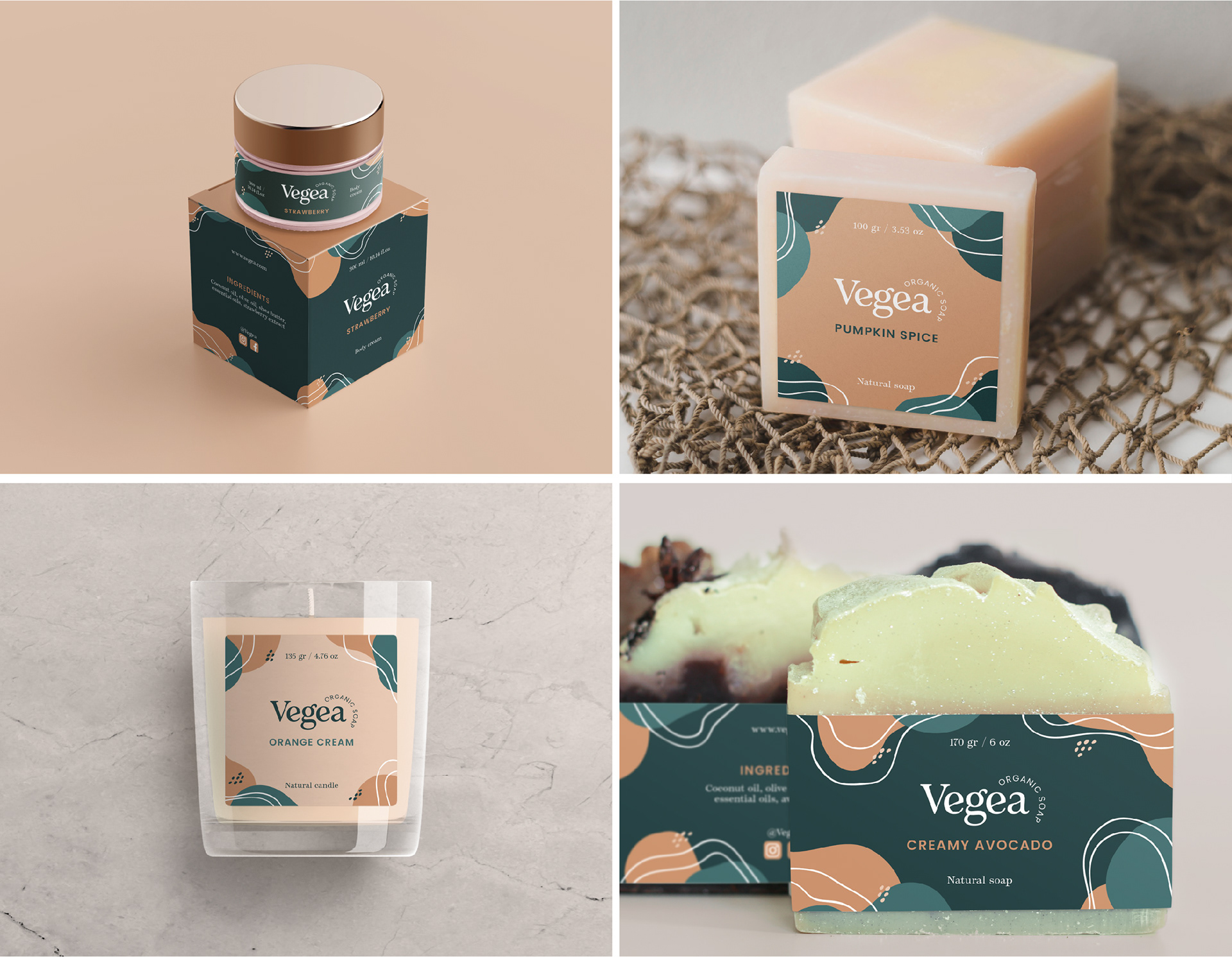
Packaging
The mail goal of the project was to design the logotype and, in order to visualise it in use, it was suggested to design some related branding materials and use mockups, so I created these examples of labels for the products.
Thank you for watching!